Brand 2.0, our new website and how they are (un)related to new year resolutions
Efe Harut, design
Happy new year blog-post readers. My name is Efe and I’m a designer who is interested in crafting good experiences for humans.
I come from a school of thought that advocates for human-centred design as a way to improve the quality of our interactions with services and experiences of them.
Putting humans at the center helps designers like me to better understand and address the problems people are facing while using products and services.
Designers are not afraid to fail and we learn from our users (humans) so we can make our designs, and thus their experiences, better. So iterating - the process of constant design and testing - is a vocational process that I have learned to internalise as well.
New year resolutions
Although I can understand how it can be an incentive to change things, I really don’t believe in new year resolutions. I didn’t change a bit on the morning of 1st January (thanks to the Alka Seltzer I took the night before). Today, I am Efe Version 1652 and maybe I will change a habit this afternoon and will evolve into v.1653. I prefer to do this all the time, rather than waiting for the earth to complete a trip around the sun (it’s magnificent but too slow for me, sorry earth).
This blog is not actually about my personal development or my remarks on how I believe that we all should be open to change more often. It is about introducing Local Welcome’s branding, our new website and how I massively benefited from iterating while working on these challenging, yet very exciting body of works.
Keep calm and iterate
Back in November 2018, we collaborated as a team to identify Local Welcome’s brand attributes by describing the value, personality, tone, and presentation of our organisation with words. I then took those words and tried to turn them into visual identity. I started by creating a color palette, bringing together some fonts and applying those decisions into visual examples.
I showed it to the rest of the team and that presentation was probably the most unsuccessful I’ve had in recent years. Part of the reason was that I jumped ahead and presented before I was actually ready, but mainly it was because I wasn’t confident enough in the work I did (I was Efe v.1600 back then).
I decided to iterate the whole exercise, starting by re-examining our brand attributes, which should be the foundation of the branding work. I filtered, questioned and refined them and in the end, I felt more confident with them. As I have started to internalise our brand attributes with my own interpretation, things began to make reasonable connections, not only in my brain but also on the work that I was doing. It helped me to build the brand brick-by-brick on top of that foundation.

It resulted in what I believe to be a much stronger visual identity, which I like to call;
Brand 2.0
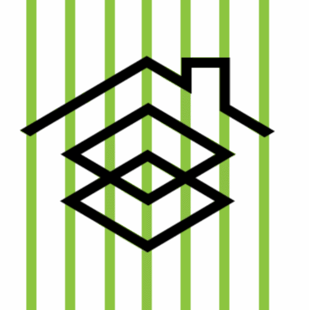
Logo
The idea behind the logo is that the first diamond represents the people and the second one social tech. As Local Welcome, we believe that when they intersect, interesting things can happen. The roof symbolises Local Welcome as an entity and how it can create a safe environment, a shelter where differences can meet.
The logo is an altered version of what Mark Hurrell designed a couple of years back (massive shout out to him). In light of our new brand positioning, I sharpened the edges a bit and revised the grid system, making sure that lines follow each other in horizontal, vertical and diagonal directions.
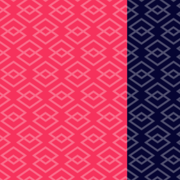
Color palette:
We wanted bold and distinctive, so our new primary colors are dark blue and bright pink. They contrast with each other in a harmonious way and even when they are converted to black and white, they are still powerful. The secondary colors, each one representing a different shade of the color spectrum, follow the same rule.
I’ve named our primary colors Impact Blue and Resistance Pink. Impact and resistance are important words describing our purpose and I believe the two colors representing Local Welcome should include this attribution.

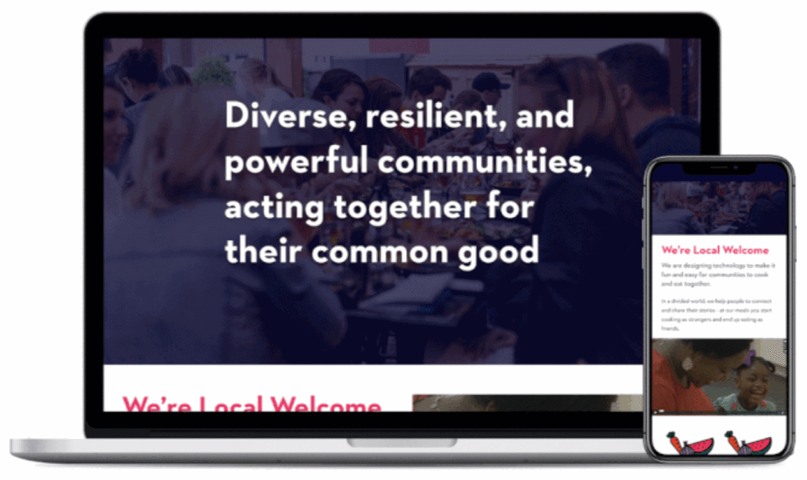
Website 2.0
During November, Shad Jahangir, who is a friend of Local Welcome and an amazing designer, created a component library on Figma for us. (Massive shout out to Shad).
After finalizing Brand 2.0, I began to import elements of our visual identity into Figma and match them to Shad’s amazing work by constructing high-fidelity wireframes for website 2.0. After review and feedback from the team, I moved into hacking a new Squarespace website following the work on Figma.
Now here it is. Enjoy it sparingly.
How I personally, and my work professionally have benefited from iteration
I am still learning how to step back from my work and try to see it through a different lens. It really helped me to decide, filter and validate the designs I made, which improved my work and allowed me to own it When I faced a wall, I needed to take a deep breath, trace my steps back, evaluate what could have been better and do it all over again.
Here’s to my first ever blog post on our new website with our improved branding.
May we all learn from our failures and be more open to, and accepting of, each other in the new year.
#impactblue #resistancepink